Overview
It’s been discussed that during the COVID pandemic, pet adoption changed. We’ve all heard that early in the pandemic, shelters were cleared as lonely people sought the company of pets. In this project, I looked deeper into this issue to learn if this rumor was true and if it persisted throughout the pandemic.
As I worked with the data, I was interested in learning the difference between adoption before and during the pandemic. The data for this project was from the Austin Animal Care Center from 2014 to February 2021. Looking at this one shelter allowed me to tell a highly-engaging and data-driven story.
Project Goals
Educate the public on the current situation of pet adoption and shelter intake.
Give animals a second chance by making them more than a statistic to the public.

Data Set Questions
Before starting to look at the data, I created a set of questions to help direct my examination:
- Which animal types and breeds are the most admitted to the shelter and which breeds are the most adopted?
- Does a “golden age” for adoption exist?
- How does sex influence being found or adopted?
- How does color influence being found or adopted?
- What are the possible outcomes for animals at the shelter and how do they correlate to age, breed, etc.?
- How are breed, animal type, or color related to the status of the animal when it’s found?
- Are animals born in specific years/months more or less likely to be abandoned (i.e. Christmas pet effect)?
- What are the typical adoption seasons, do they correlate with anything?
- Can we see the story of each individual animal?
- Have any of these previous patterns shifted during the pandemic?
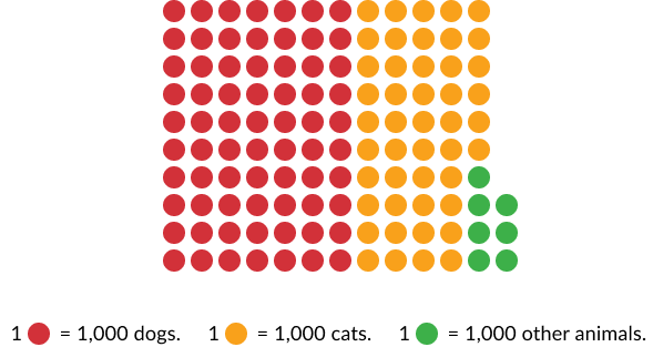
Below is a visualization of all of the animals within the data set.
Using Tableau
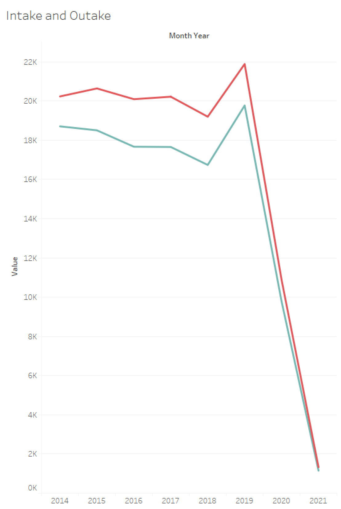
I then worked in Tableau, a data visualization software, to answer my questions. Below, you can see some of the graphs that I created. On the left, there's a line graph, which shows how the number of animals coming into and leaving the shelter are generally proportional. When the pandemic began, there were less animals in the shelters because less people were abandoning their animals.
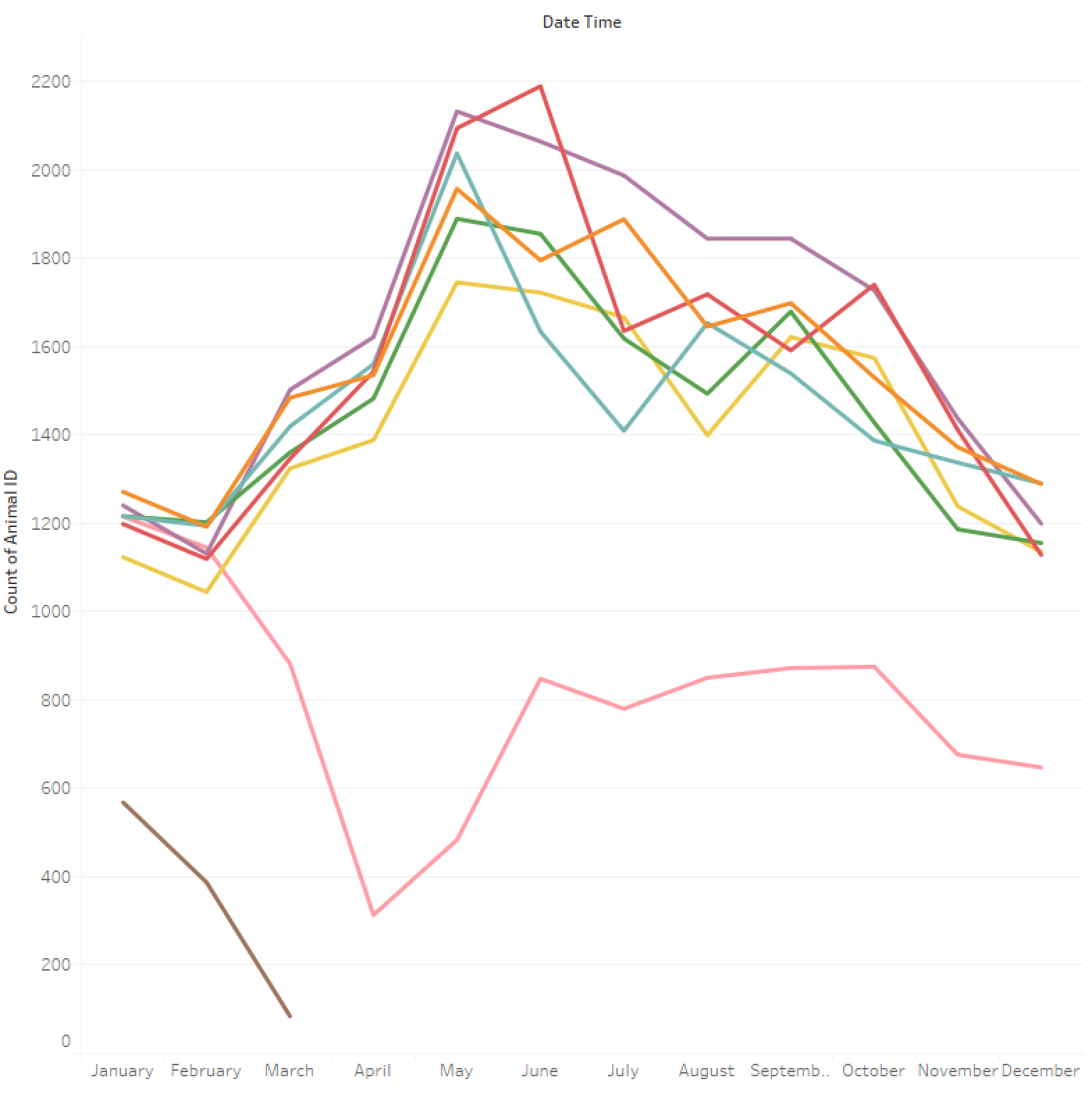
On the right is intake into the shelter by month. Each line shows a different year. The pink line is 2020. You can see how intake drops when restrictions were put in place that year. The brown line is 2021. You can see how intake continued to drop after 2020.
Creating the Design
Once I had discovered the answers to my questions, I began to recreate the visualizations that I had created in Tableau in Figma so that I could use Figma's interactive animations to show changes in the data. Tableau allowed me to create graphs, but it wouldn't allow me to create the level of detail that I wanted in my storytelling.
The visualizations in this project consist of dot visualizations and line graphs. The dot visualizations allow users to really see the amount of animals for each sub-set of the data. I decided to use dots to emphasize the importance of the animals within this visualization. The colors for the dots are taken from the shelter's logo.
The line graphs are used in sections of the data which show change over time. The line graphs stand out somewhat because of how the dots are used throughout, but the line graphs show that data in an easier to understand way.
The clicky-telling design that I created is based on the scrolly-telling trend in data visualization. You use the arrows on your keyboard to navigate through the design and the visualizations animate through changes of the screens. You can select full screen to interact with the design.