What if you knew exactly how productive you were that day?
Productivity evaluation is an important part of staying productive, which is why my team created Insights, a tool which encourages users to have a holistic understanding of their productivity.
When we began our project, our focus was on the area of task management, due to our own struggle with motivation and organizing tasks to maintain productivity. We narrowed our project to the area of productivity evaluation during our research process. If you understand and reflect on your productivity, then you’re able to come up with strategies to manage your tasks more effectively.
During our research process, we were inspired by the COVID-19 pandemic, in which a lot of people work remotely or design their own work schedules. While flexibility is good, it is accompanied by difficulty with estimating productivity. Insights helps students and working adults who have concerns about their productivity to accurately reflect and understand their productivity.
Role
UI/UX Designer
Group Administrator
UI/UX Designer
Group Administrator
Tasks
User Interviews
Wireframing
Prototyping
Data Visualization
Interaction + Visual Design
User-Testing
User Interviews
Wireframing
Prototyping
Data Visualization
Interaction + Visual Design
User-Testing
Duration
One Year
One Year
Why is productivity evaluation important?
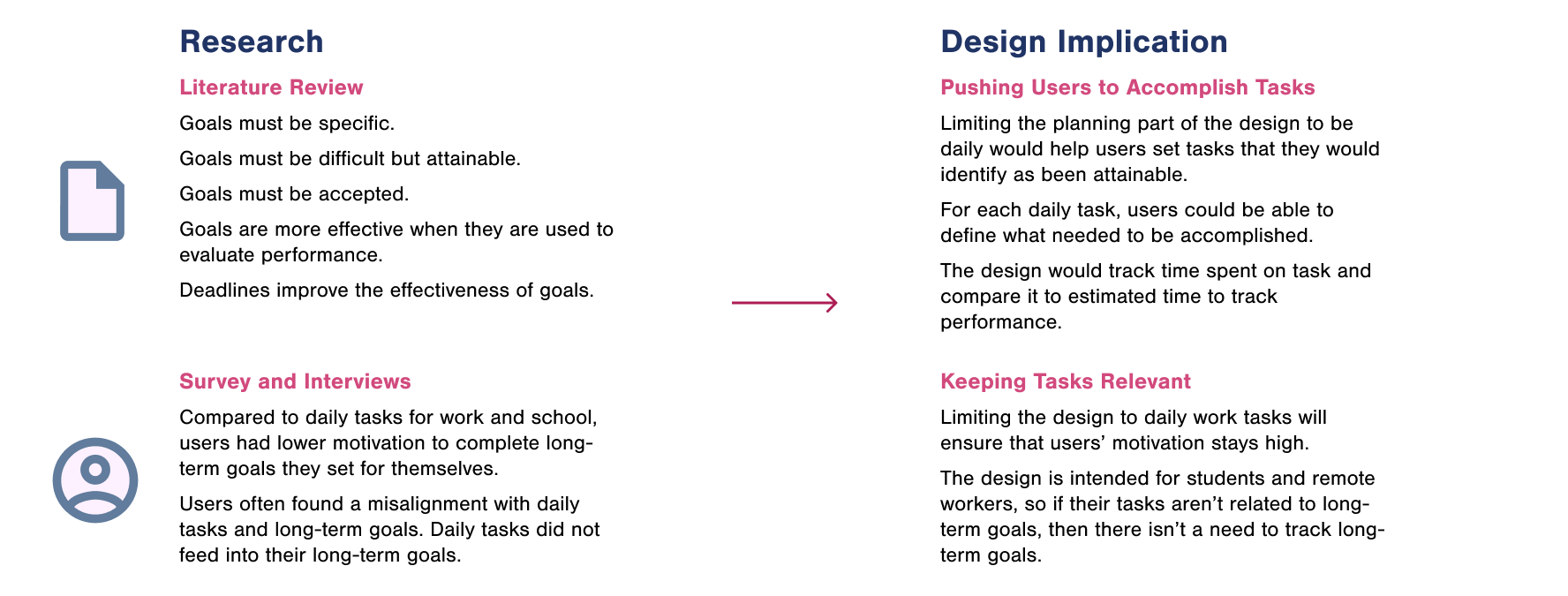
There are many difficulties involved in understanding productivity. People forget what they have accomplished, because of the multitude of their tasks, and how effectively they accomplished those tasks. It’s difficult to keep all tasks in mind and objectively evaluate them. While attempting to evaluate, people can be overwhelmed and unsure where to start.
When people don’t know the factors that feed into their productivity, they’re not able to understand how to sustain their productivity. I think that by teaching people about their productivity and by being transparent with how this tool evaluates productivity, users will be able to understand productivity evaluation better.
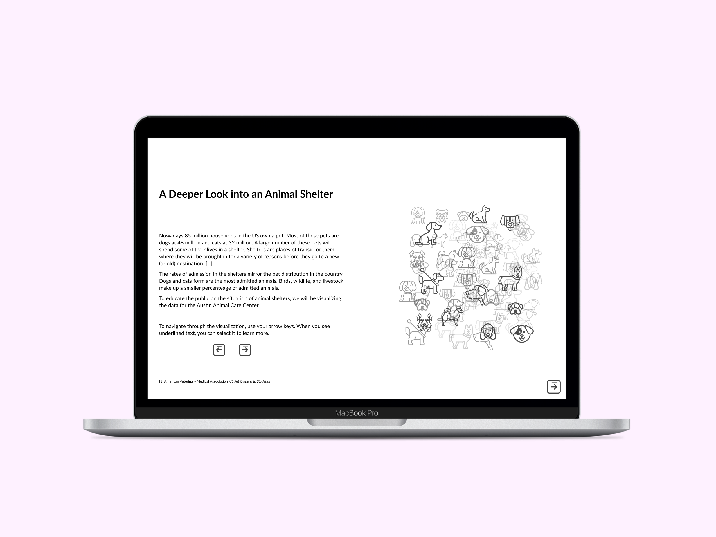
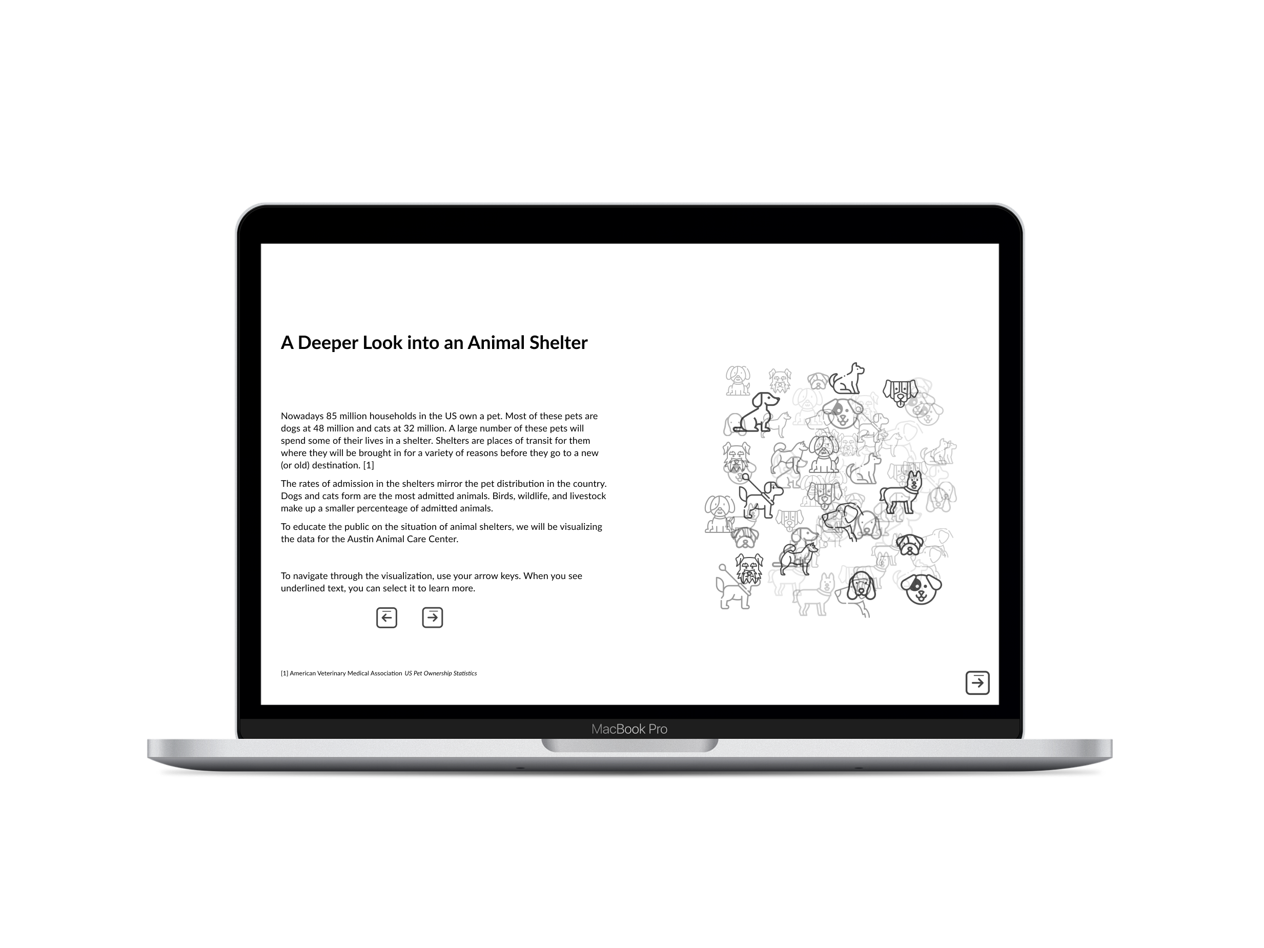
Who is Insights for?
Insights is intended for people who have concerns about their productivity. Specifically, people with flexibility in their work lives, such as remote workers and working students. My team chose to focus on these people as our target users, because they have more difficulty assessing their productivity due to the flexibility in their schedules.
The Process of Creating Insights
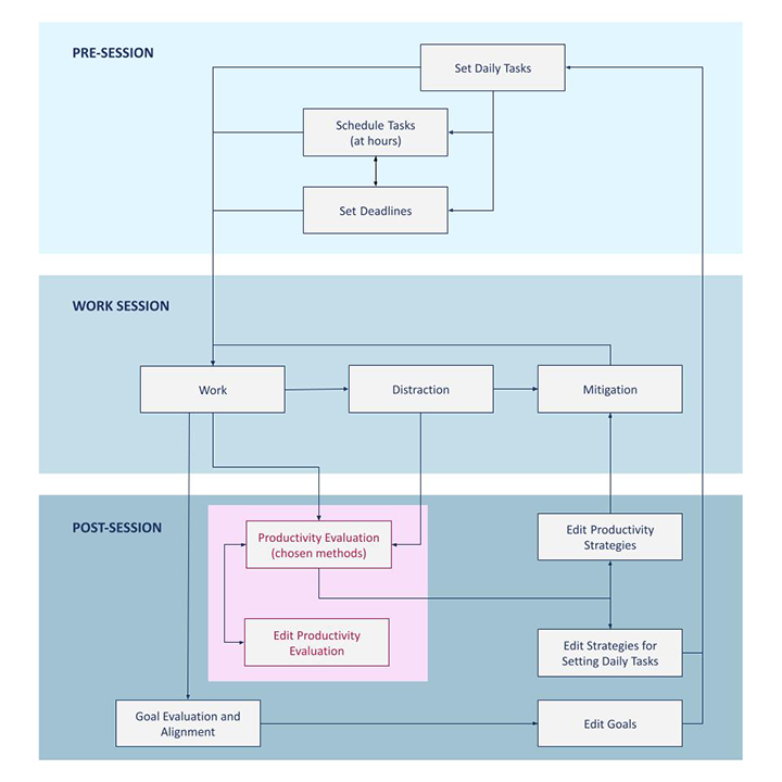
Productivity Evaluation is Reoccurring
The pink part of the task analysis shows how after people work, they then evaluate their productivity. This productivity evaluation feeds into people changing their planning, work styles, and productivity evaluation methods. When changing the evaluation method, the person may then evaluate their productivity again.
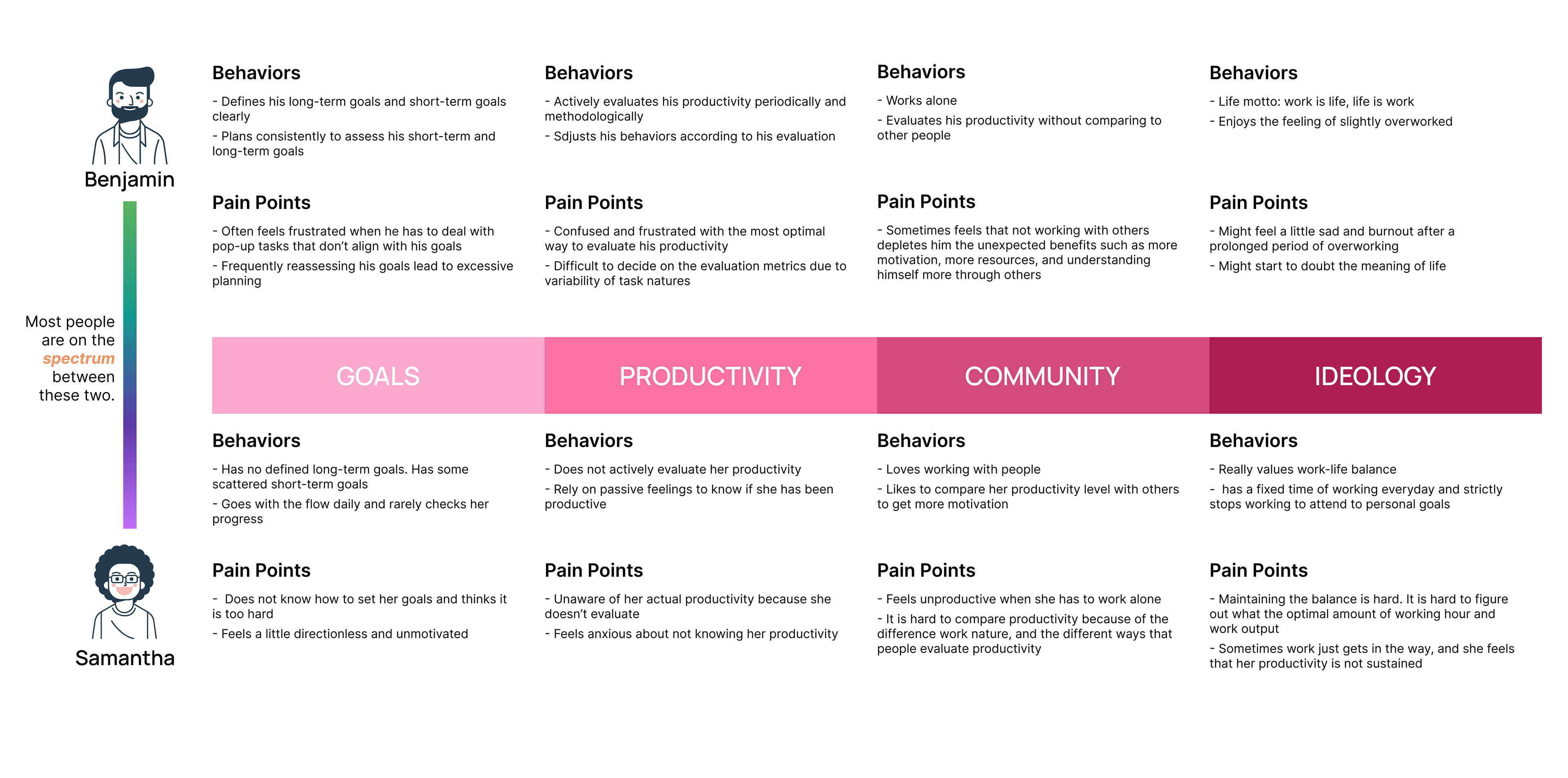
Productivity Evaluation is a Spectrum
The way that people think about productivity is highly influenced by goal-setting (long-term planning versus short-term planning) and ideologies (work or life first), so we dissected our users based on these characteristics that we found when affinity mapping. We extrapolated the extreme ends to Benjamin who is an over-planner, evaluator and worker, and Samantha who just goes with the flow. We acknowledge that one can be Benjamin for one characteristic and Samantha for another.
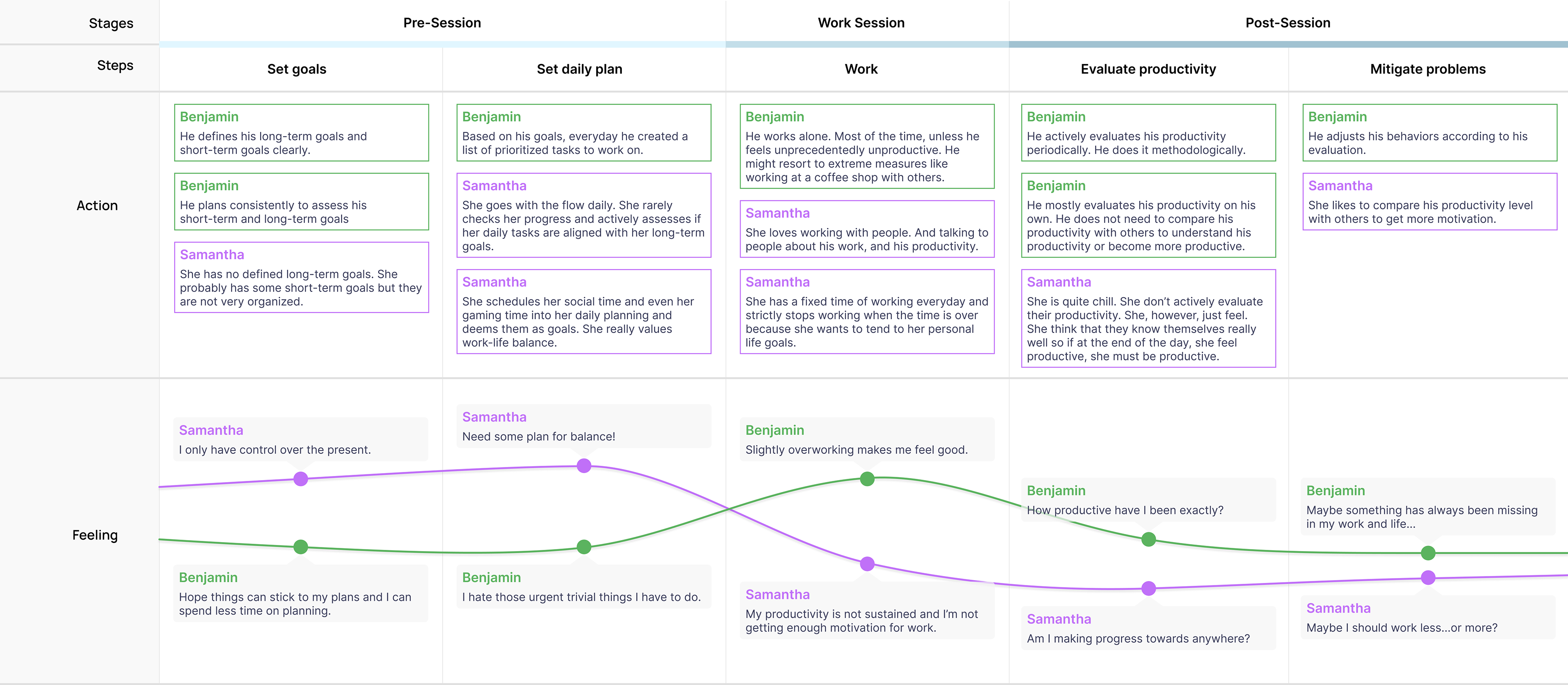
The Daily Journey of Productivity
After we created the spectrum of Benjamin and Samantha, we mapped out their daily work flow and their pain points accordingly. Their daily work flow begins with creating a plan for the day, working, reflecting on their productivity and mitigating any problems. This work flow is an iterative cycle.
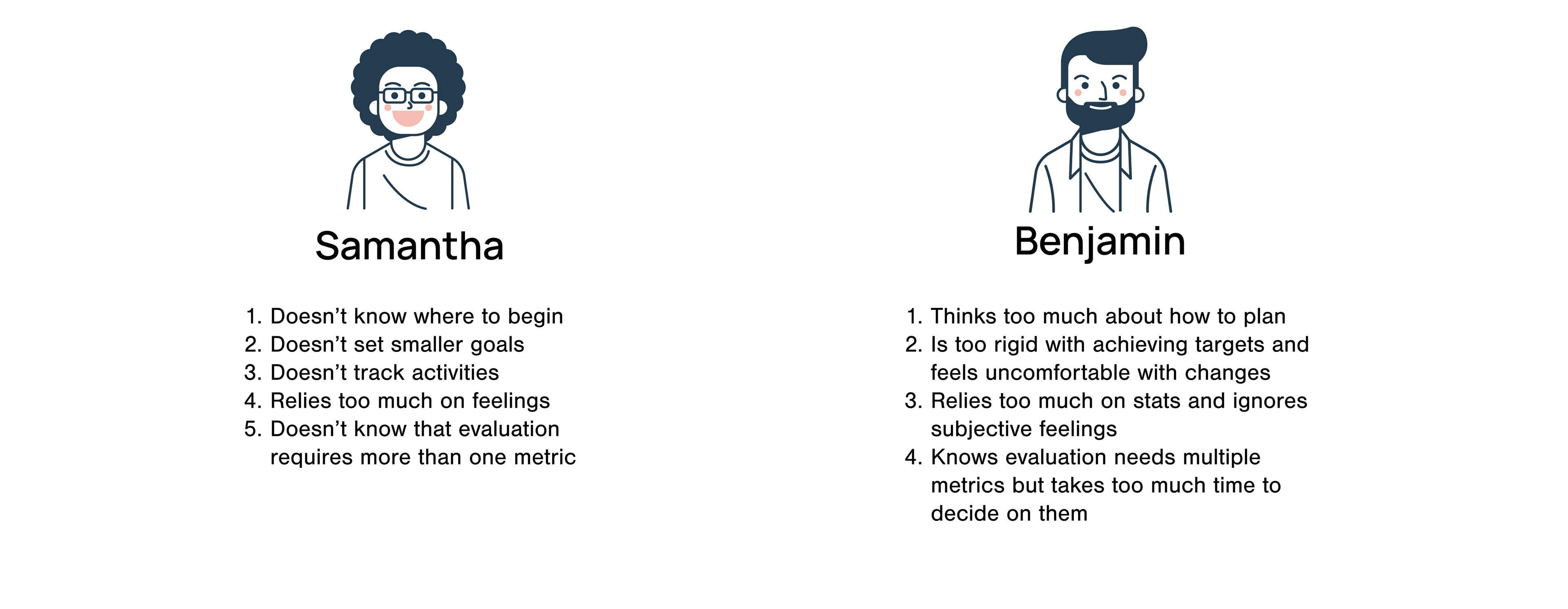
User Problems to Address in the Design
Once we had finished our research, we summarized the major problems of our personas so that we could ensure that we would address them in the design.
Brainstorming
After adding design ideas to our affinity model, we decided that brainstorming based on small parts of the system wasn’t that helpful, because productivity evaluation requires multiple parts of the design to feed into one another. We decided that we would instead brainstorm the larger structure — how the different processes of data collection, task reflection and data visualization feed into one another.
Comprehensive Brainstorming
Comprehensive brainstorming meant thinking about a design as a whole. We used the task analysis as a guide for the different times that a user might use our tool: planning work, actually working, and then evaluating work.
After creating comprehensive structures, we then chose the overall task flow of the design.
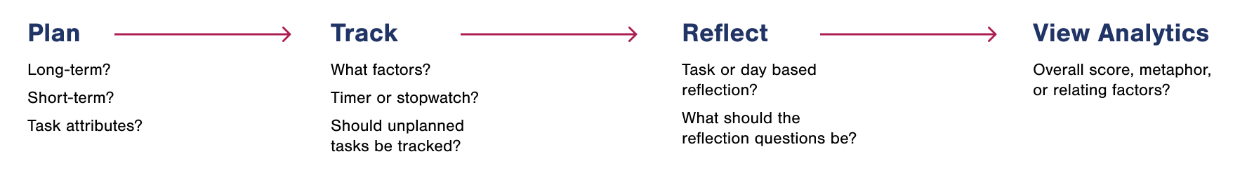
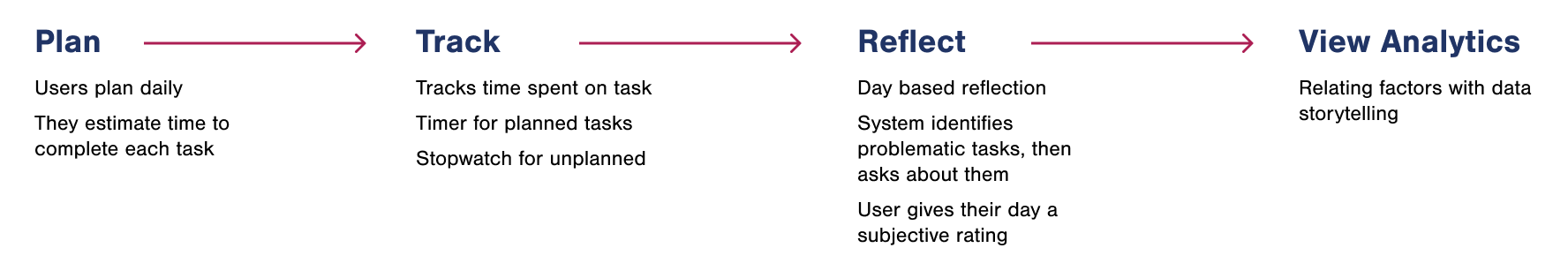
The Task Flow We Chose
Based on the comprehensive brainstorming, we knew what the overall structure of our design would look like. Users would first plan their tasks, then track them while they worked. Once they were done working, they would either reflect on the tasks individually or their work as a whole. After working, users would view their analytics.
While we knew this task flow would represent the design, we still had some questions about the individual sections. For the planning and analytics sections, we were able to answer most of the questions ourselves. But for tracking and reflecting, we decided that we would create wireframes, then test them with users to answer these questions.
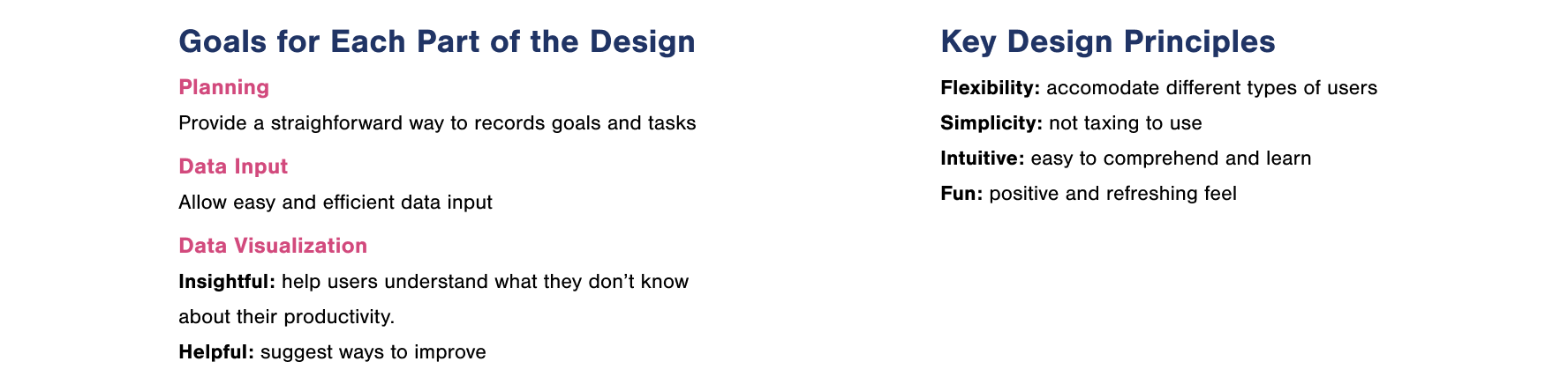
Project Goals and Design Principles
In order to ensure that our design would not only solve user problems, but would solve them well, I suggested that we create a set of project goals and principles. This set is a guideline for structuring and evaluating the design.
Should users plan short-term or long-term?
To answer this question, we looked back at our research. Based on our research, we decided that the planning section of the design would be daily to help users complete tasks that they set for themselves. We also decided that planning should be short-term, because short-term was relevant for the types of tasks that users would be working on.
Choosing How to View the Analytics
We each created a set of wireframes which included ways to collect data, then visualize it. I created the second concept. It combined thinking of productivity as being like baking with data storytelling.
We decided to answer the question from the task flow about how the analytics would appear ourselves, while we chose the best set of wireframes to take to users.
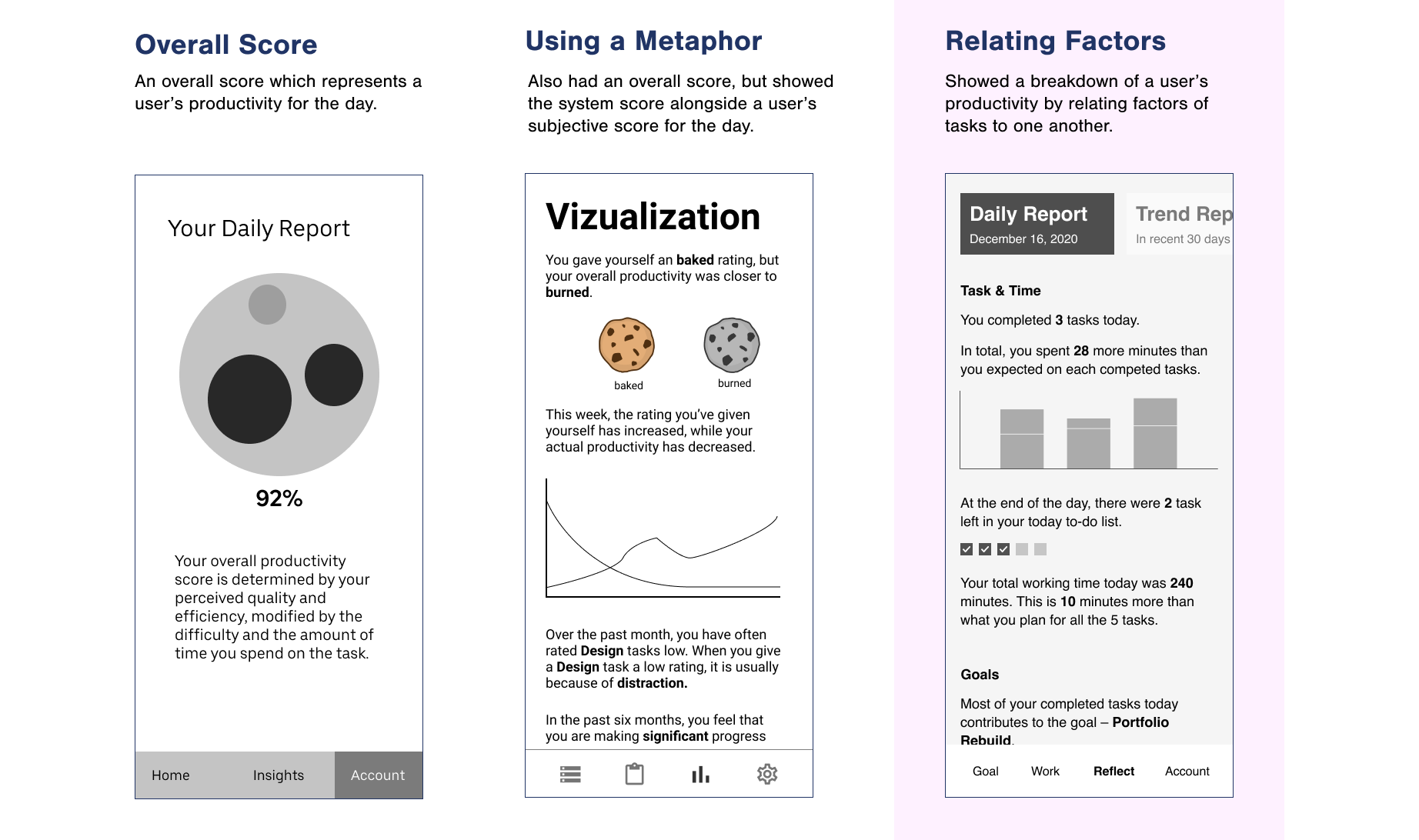
Of the three structures, we decided on the third idea for the ease of execution. Having an algorithm to decide an overall score might complicate the system for users. While a metaphor would make the design more interesting, it might also be difficult for users to conceptualize.
The third structure related the data together in ways that made productivity easier for users to understand. But the concept wasn't complicated by a difficult to understand score or a metaphor. We also took aspects of storytelling from the second concept so that users would be able to understand and reflect more easily on their productivity.
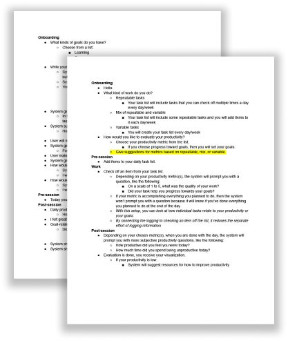
Wireframes
We refined the third concept from our wireframes, then took it to six users for user testing. We had A/B sections for the tracking and reflecting parts of the design. In the user testing sessions, we had users walk through what they thought was happening in each of the screens. When they finished going through a section, we asked if they preferred A or B.
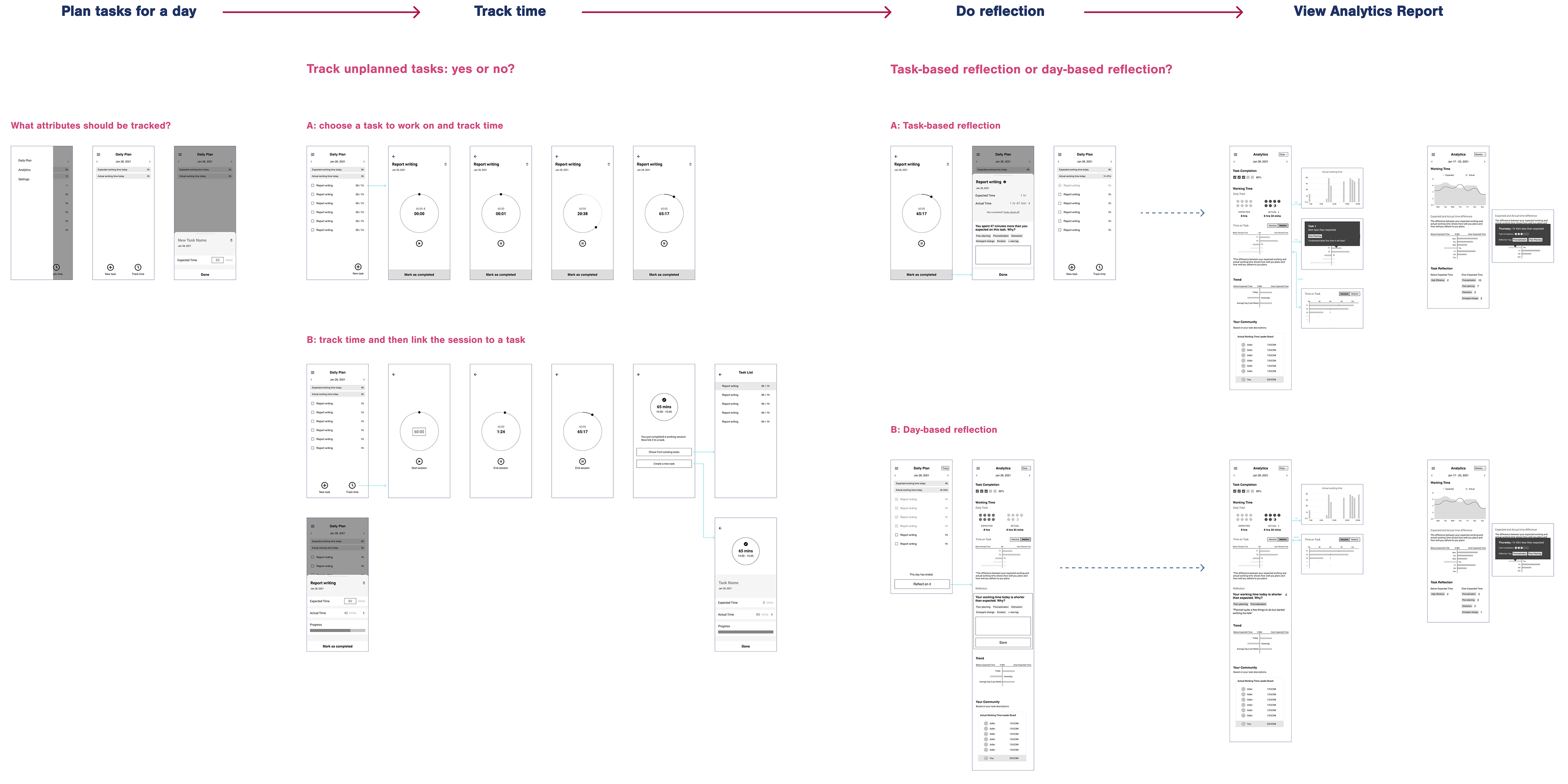
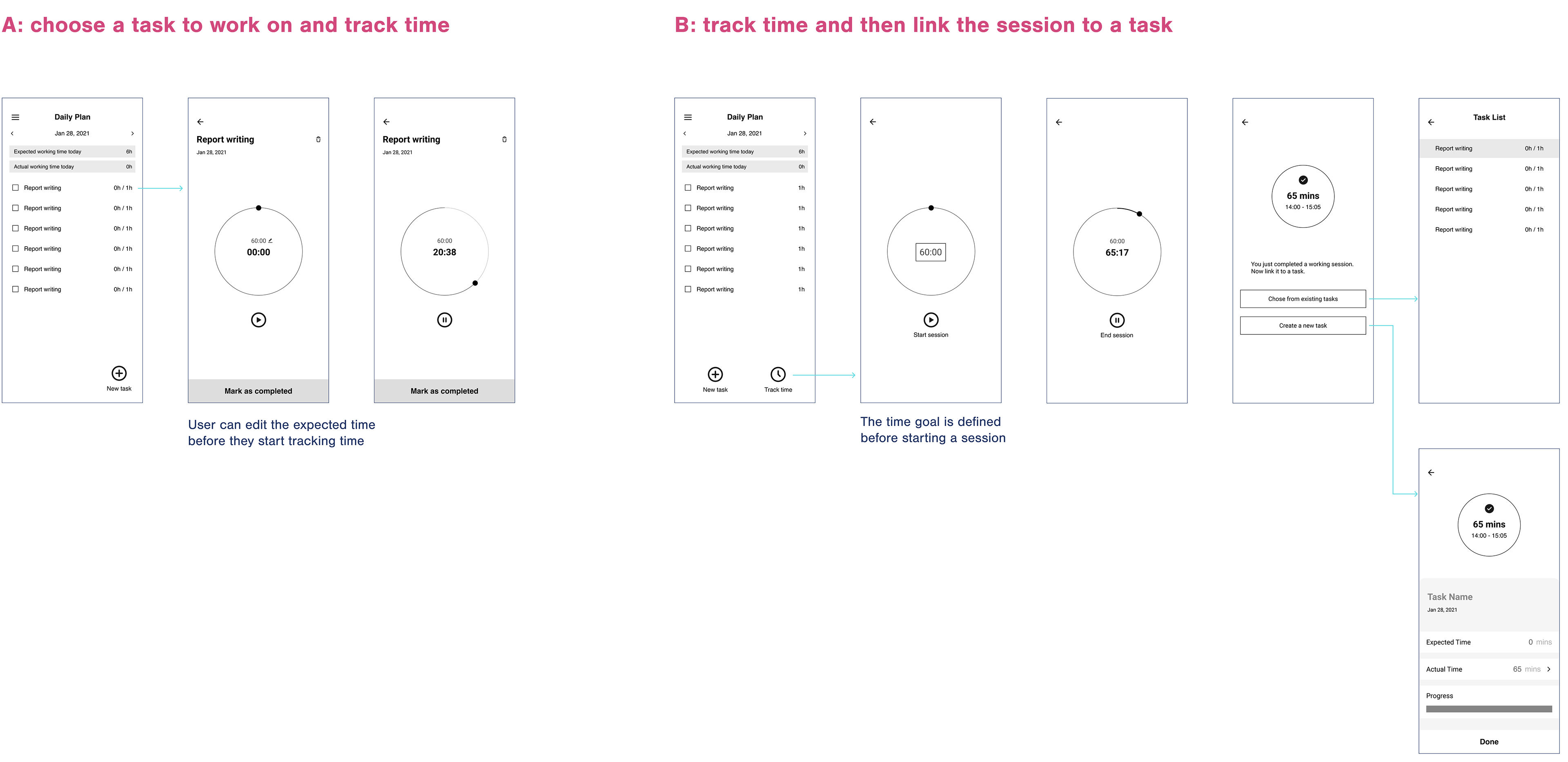
Should unplanned tasks be tracked?
Users liked the idea of being able to record spontaneous tasks that would appear throughout their day. They said that they would use both the unplanned tracking and the planned way of tracking tasks. We had thought that users would want to use a stopwatch when tracking tasks, which would then show when users went overtime, and a timer for unplanned tasks. But users actually preferred the timer for planned task tracking and stopwatch for unplanned tracking. They said that they usually weren't able to estimate time for unplanned tasks.
We decided that the planned task tracking would use the timer. Planned tasks would have a time estimated by the user, so the timer would count down from that time. Users liked the unplanned tracking feature, so we decided to include it in the design using a stopwatch.
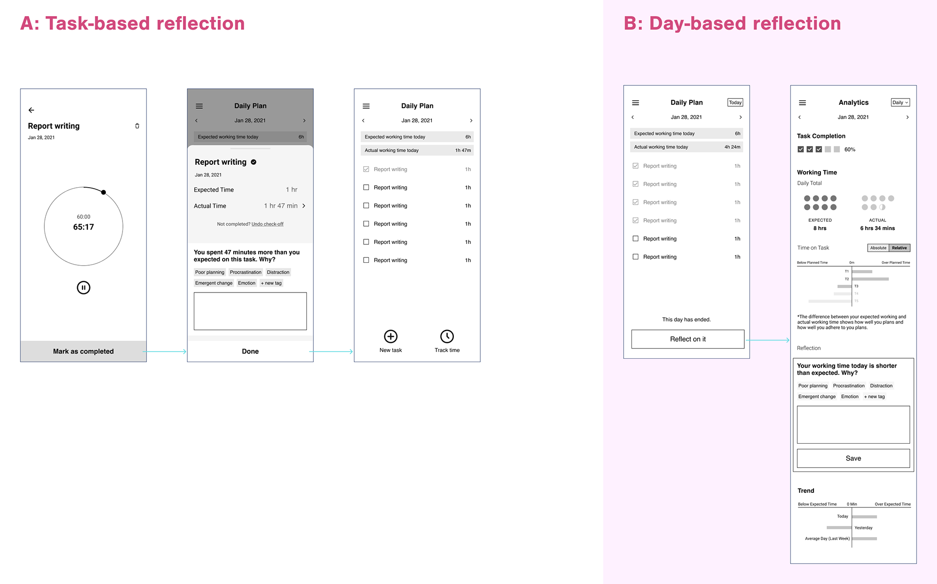
Task or day based reflection?
Users said that they liked the granularity of being able to track information for each task, but they preferred to only do one reflection per day. They thought that they would be able to complete one reflection per day, rather than multiple reflections per day.
Task Flow Based on User Feedback
The following task flow shows the decisions that we made for each part of the design, taking into account our research and feedback from users. Before creating a mid-fidelity prototype, we decided that we needed to spend some time thinking about the data visualizations in the analytics. This part of the design would be crucial because it would allow users to visually interpret their productivity.
Brainstorming Data Visualizations
While we knew that we wanted to relate the factors that were being tracked to one another and combine the data visualizations with storytelling, we didn't know what graphs to use. We brainstormed different visual ways of showing the data.
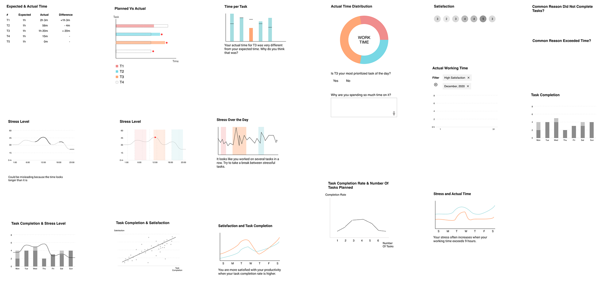
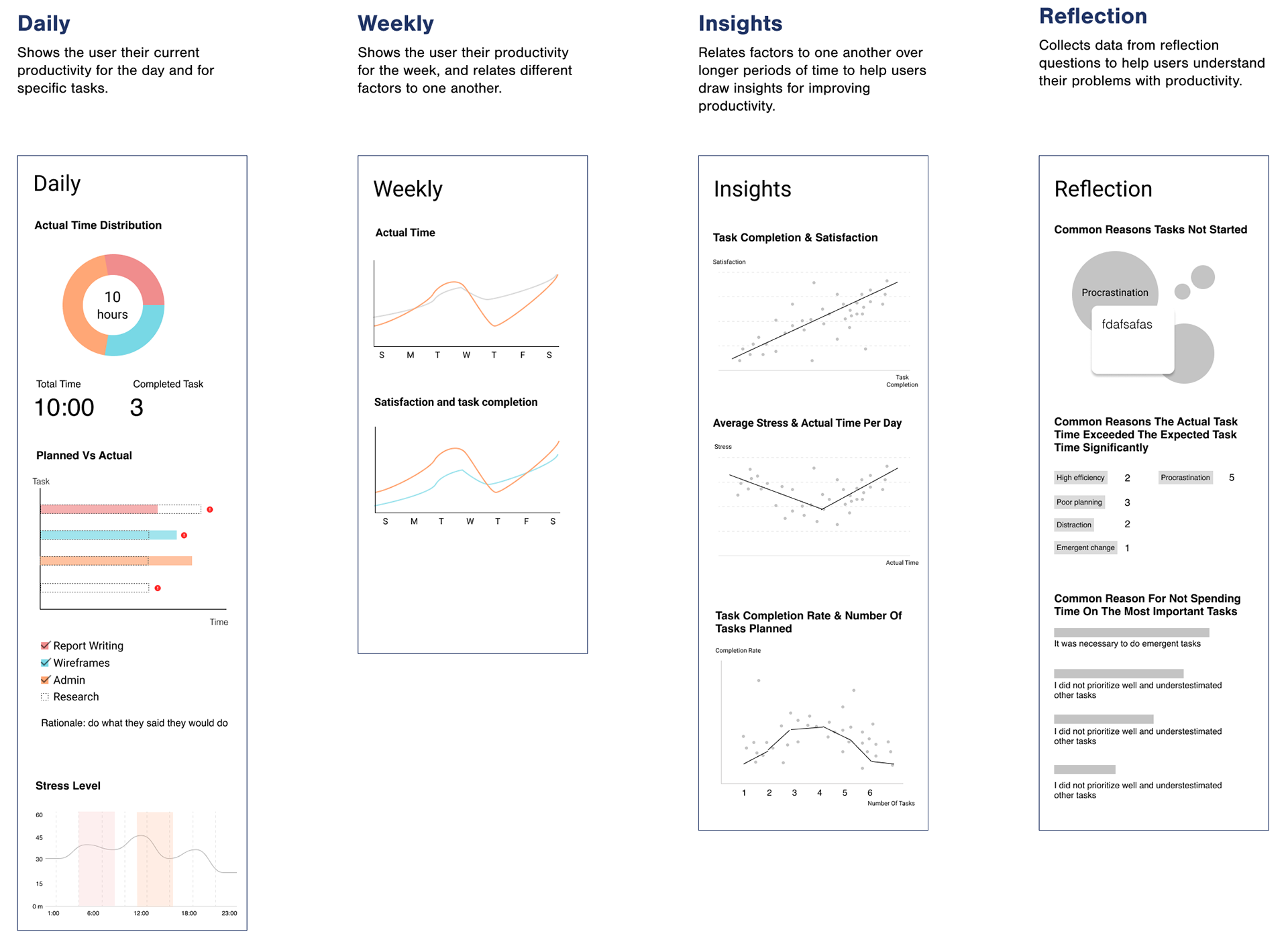
Splitting Analytics into Four
After ideation, we decided to split the analytics into the following four sections with these graphs chosen from the ones we created in our ideation. These sections would help users gain an understanding of their current productivity, then understand ways to improve it.
Mid-Fidelity
After deciding what would be contained within the analytics section, we then brought our prototype up to mid-fidelity by integrating the user feedback and the choices that we had decided on within the task flow.
However, our mid-fidelity design lacked cohesion, so we decided to ideate on the design's visual style.
Visual Style Ideation
In this ideation, we thought about how we could create visually similar elements within our design. Some of the elements that we found had a classic look, which we associated with time and articles. Because our design was highly focused on tracking time, we thought that reflecting the look of a clock would be consistent with the focus.
The Style Guide
Overall, we decided that visuals should be minimal, warm, and informative with two main colors: purple and orange. We wanted to have two colors so that we would be able to represent different factors on the analytics pages with different colors. Throughout the design, we wanted to eliminate unnecessary visuals.
We also thought that because we would be including analytics with insights in our design, the insights should seem convincing, so we decided to use a Serif for our main font.
High Fidelity Prototype
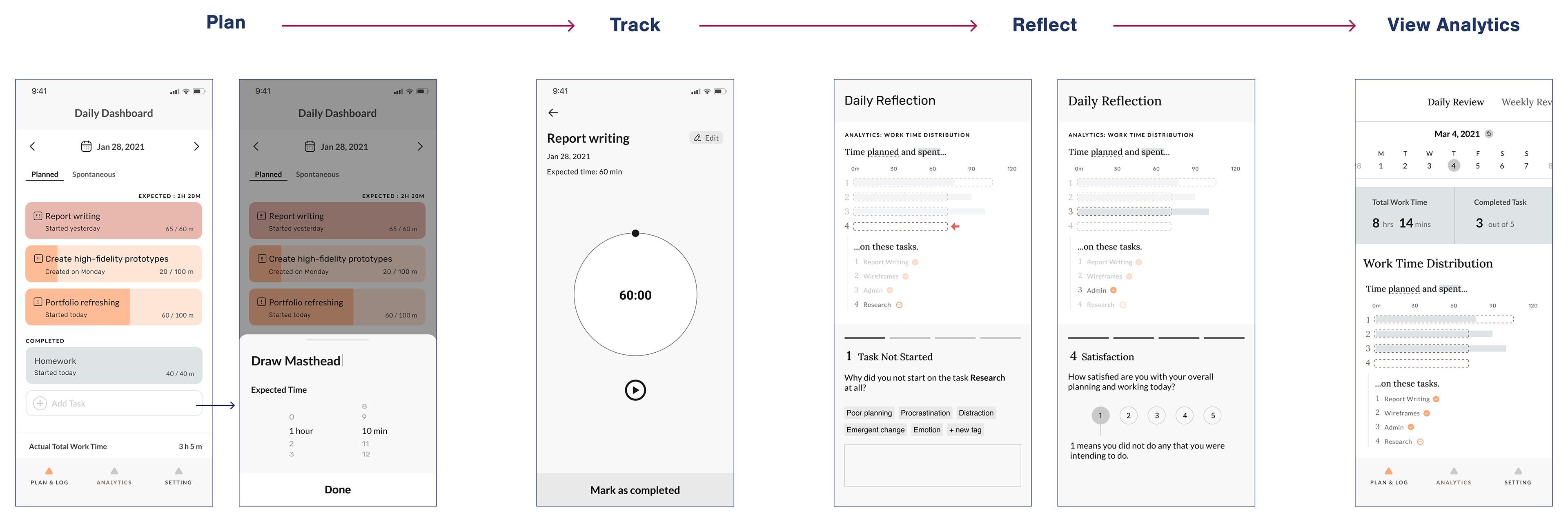
Before creating the high fidelity prototype, we did an internal critique of the the mid-fidelity prototype to fix grammar, spacing, and any other issues that we noticed. We then used the style guide to create the high fidelity prototype, and added visual details, such as IOS elements.
I'll walk through each of the sections of the prototype in order of the task flow: plan, track, reflect, and view analytics. I created the analytics portion of the prototype.
User Testing Results
After we finished designing our high fidelity prototype, we wanted to understand if users could complete the major tasks involved in our design and if they had any major problems navigating the prototype, so we decided to conduct task-based user testing.
In the user testing, users were able to complete each of the tasks given to them. Their difficulties with the design mostly had to do with understanding the data visualization. It seemed that for most of our users, they would have liked more of a text explanation of what they were seeing or an initial tutorial.
Next Steps
While my team has finished the work that we would do for this project, if I were to continue to work on it, these are the next steps that I would implement in terms of priority:
1. Focus iterations and explorations on the area with the most user feedback ‒ Analytics.
2. Include actionable recommendations for users into the loop of our design to increase productivity.
3. Possibly include gamification to increase motivation for users.
4. Explore the option of designing our app for cross-device usage.
5. Specifically for the Weekly Review: Test and validate the usefulness of the graphs.
Lessons Learned
After working on this project, I realized that each person in a group has a very different perspective. While different perspectives offer beneficial divergence, they can also make it difficult to stay on the same page. During our first semester, we experienced a lot of group tension, because of difficulty with resolving conflicts between our different perspectives. We discussed our group dynamic problems so that we could reach a solution that would allow us to all move forward together.
It's important to record all decisions and the reasons for why those decisions were made. When looking back on the process, you need to be able to understand why you ended up where you did. By basing the design on research, I learned to be more analytical about design choices. Design choices may seem to be aesthetic on the surface, but they should always have a reason.
Task management is something that I struggle with, but working on this project helped me learn about techniques for improving my own productivity.