Overview
Currently, students on the Georgia Tech campus use an upload-based printing system to print their documents. Our team discovered through our research that this system suffers from several problems. It is important that these issues are solved, because Georgia Tech students rely on the printing system. To solve the problem, we created a design that combines crowdsourcing and a chatbot. The design would be integrated with the current web-based printing system.
Role
UI/UX Designer
Content Editor
In Charge of Submissions
UI/UX Designer
Content Editor
In Charge of Submissions
Tasks
User Interviews
Wireframing
Interaction + Visual Design
User-Testing
User Interviews
Wireframing
Interaction + Visual Design
User-Testing
Duration
One Semester
One Semester
Project Process

Problem Space
Even though most people tend to go paperless, it’s quite obvious what motivates students to forgo that trend – it’s necessary for them to print a particular document or it is an essential step in helping them achieve their goals.
Most of these goals have a common characteristic – getting the job done. Printing is largely a functional task, which requires efficiency. When there isn’t efficiency in a printing system, students become anxious, especially if they are in between classes or generally pressed for time.
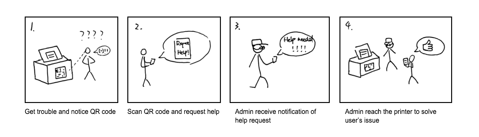
We initially discovered this problem space when we had problems printing. After discussing these problems with fellow classmates, we discovered that they also had difficulty. We decided to research to see if printing was as much of a problem as we thought.
Users
Primary
Our primary user group for this project were the students on the Georgia Tech campus who rely largely on the GT printing system. GT students need to print often for classes, which causes printing to be stressful when it doesn’t work as it should. Especially because most students rely on the printing services provided by the Office of Information Technology (OIT).
Secondary
The secondary user group contained the staff in charge of the printers and printing system, including: Printing & Copying Services, the OIT printing help department, and the staff or students who maintain the printers in each building.
Tertiary
They included professors and teaching assistants who receive printed assignments from students, as well as other departments in OIT, which purchase the printers, develop the printing system, and handle other related tasks.
Researching the Problem
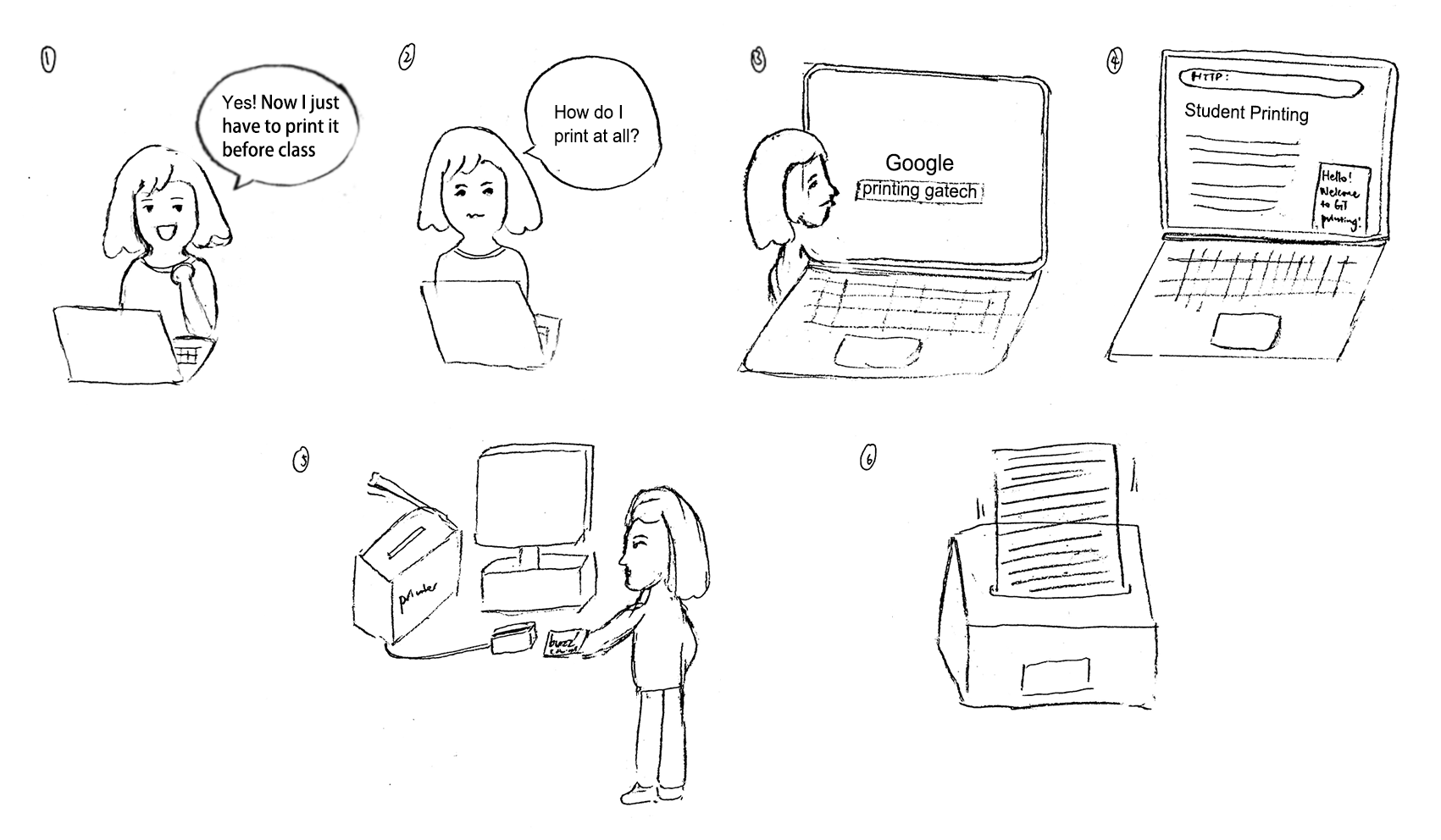
First, we interviewed students on campus about their experiences printing, what problems they have, and what part of the system they like or dislike. During our interviews, we discovered that some users prefer to use the downloadable print driver while others other prefer to use the Print Center website.
After interviewing several students, we decided to conduct a survey to discover what kinds of problems most users have with the printing service. Our goal was to get distribute the survey to as many students as possible so we forwarded it to all of our classmates and sent it out on social media.
After analyzing the results, we found:
Users have difficulty understanding the system.
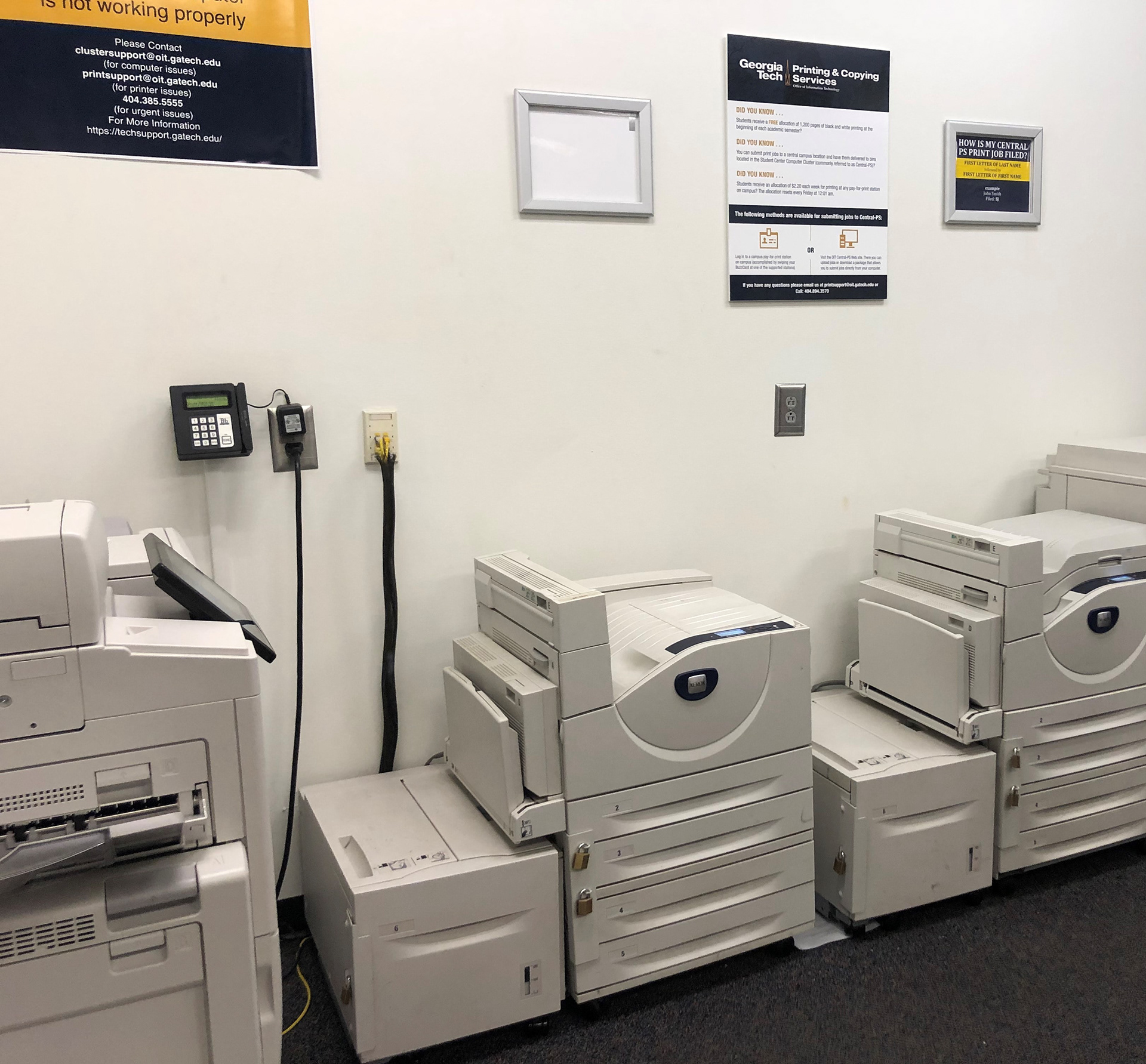
Users will go to printers, which have issues (out of ink, broken, etc.).
Users are not able to find printers in general.
Users have problems, but do not receive help quickly.
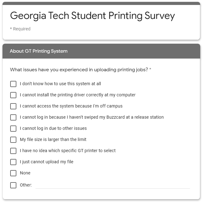

One user told us:
"I don't know how to use this system at all and I'm always finding broken printers."
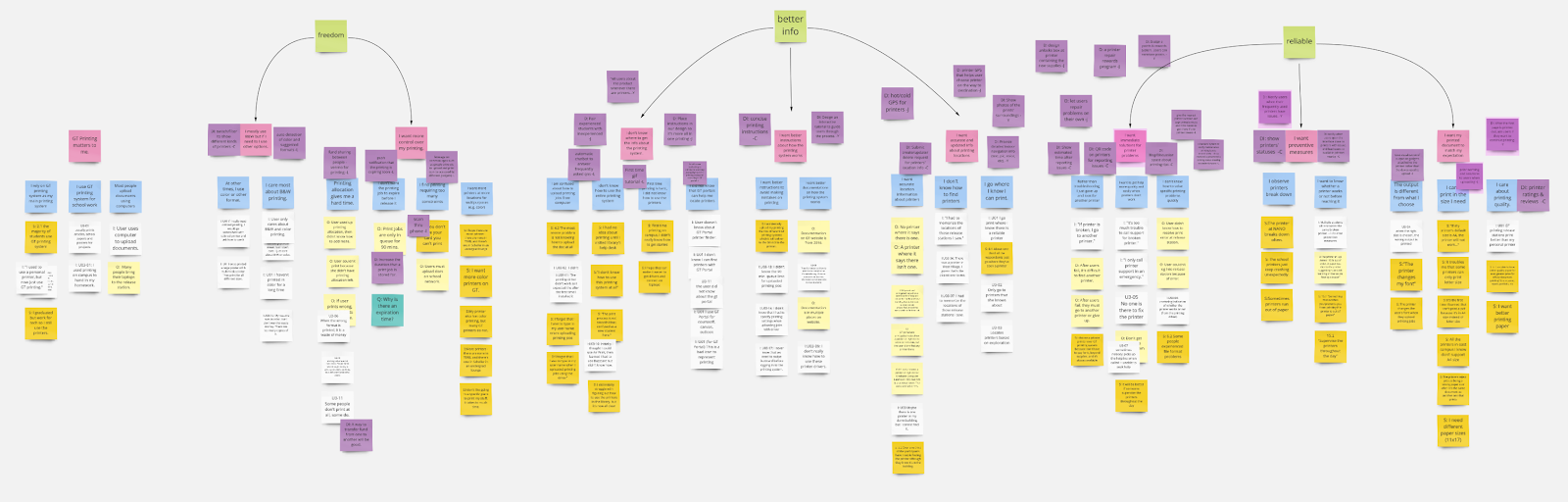
Affinity Modeling
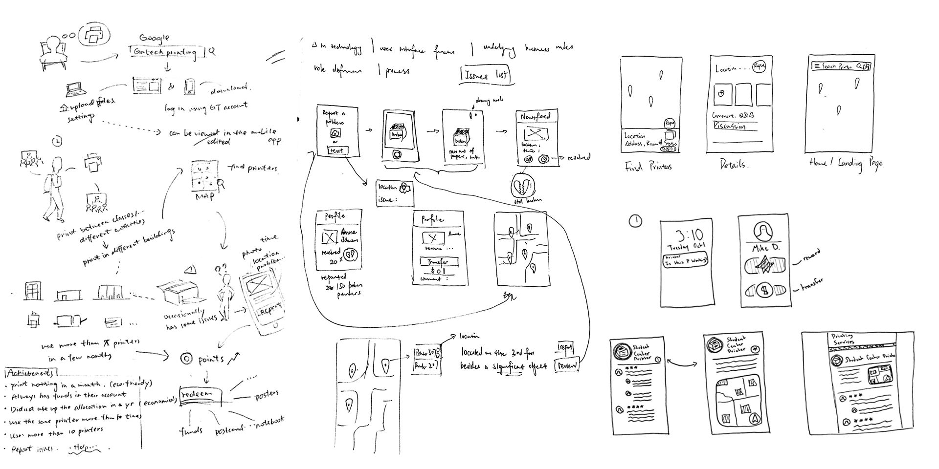
We used the results from our interviews and survey to affinity model.
Understanding the Tasks
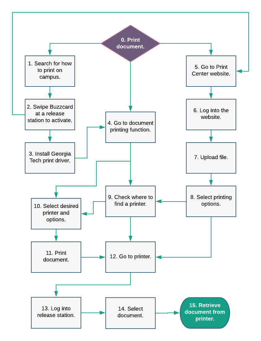
I created this task analysis so that our team could better understand the convoluted process of printing. After creating the task analysis, I realized how many steps are involved in the process.
Some steps are necessary, while others exist discretely. For example, users can either use the downloadable print driver to print or go to the Print Center website.
Once users understand the system, they'll be able to reduce the amount of steps, but that doesn't mean that even when they know the system, they won't run into the same problems that first time users encounter.
Moving into the Design Phase
For our project, we decided that we would look at how the Print Center website could be better designed for users. We chose not to include the print driver in our process, because the Office of Information Technology informed us that the print driver requires users to often download a new driver package so that they have access to new printers that are installed on campus.
We wanted our solution to be easy to access with little need for upkeep on the part of students.
Visioning
Creating Design Alternatives
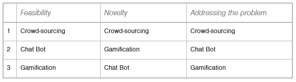
After visioning, my team decided on three distinct design alternatives:
Crowd-sourcing: Allows users to contribute information about printers to keep the system up to date on their locations and problems
Chat Bot: Uses questions to direct users to the information that they're looking for
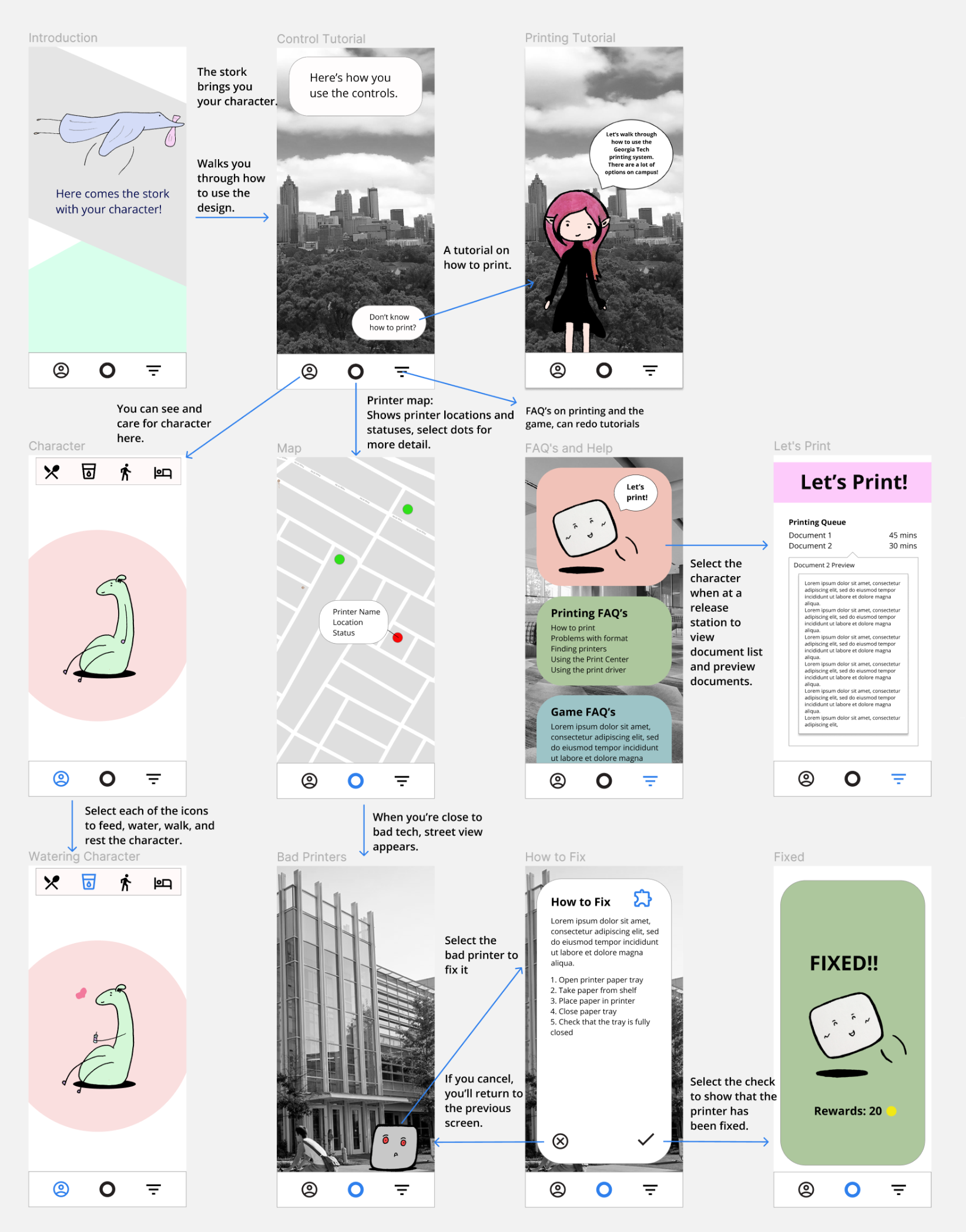
Gamification: Makes the problem space more fun and less stressful
Design Alternative Mockups
Choosing the Solution
After a peer review session with 60 of our classmates, we decided to choose crowd-sourcing because it ranked the highest in the three categories that our peers reviewed and we thought that the solution made the most sense for the problem. We received the best comments about this solution.

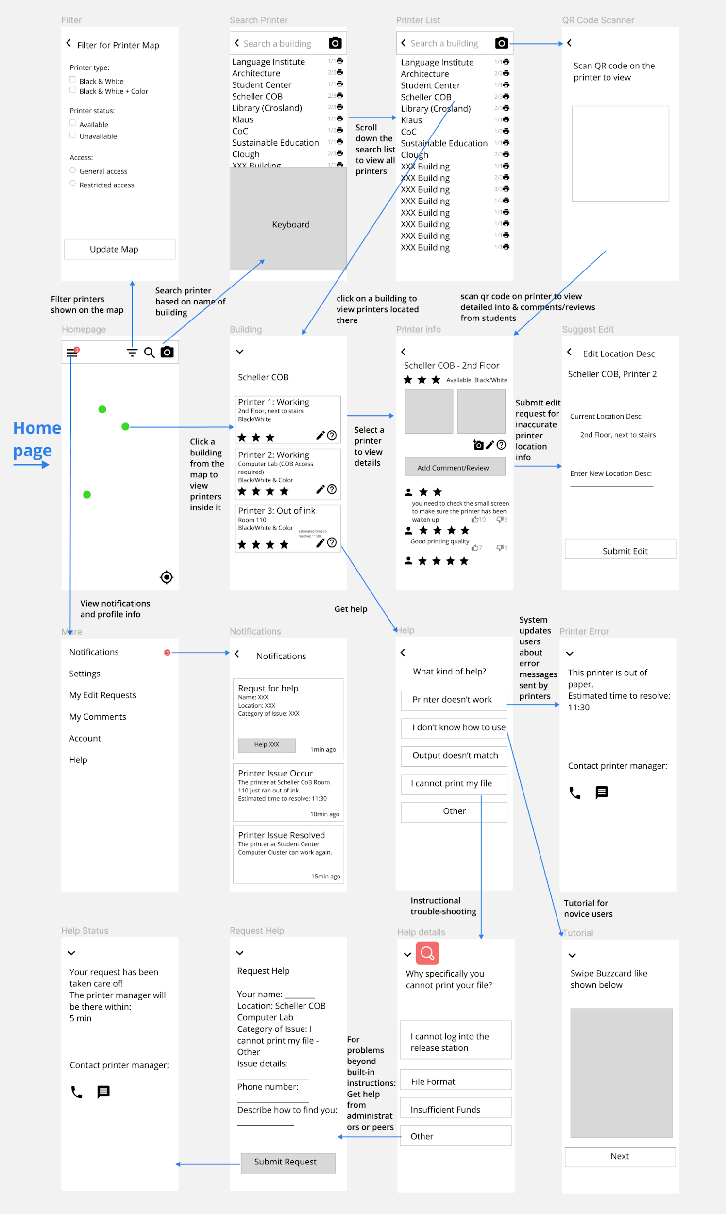
New Wireframes
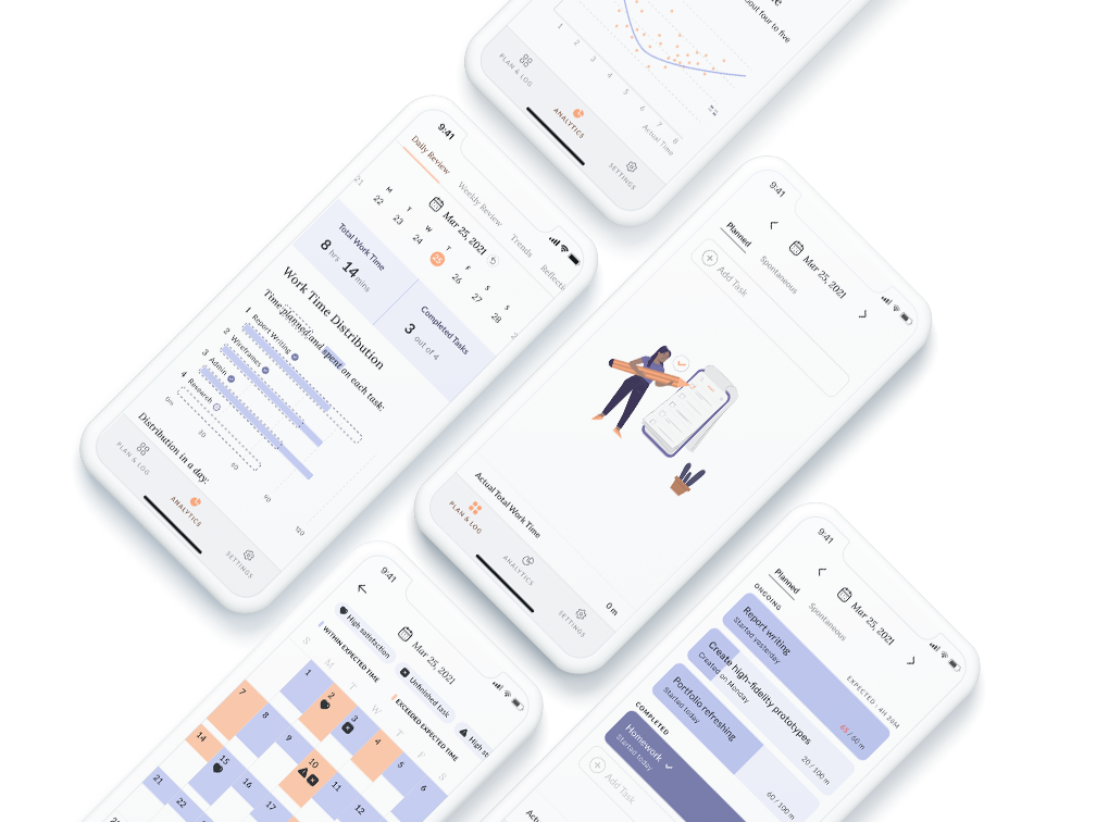
We decided as we worked on our crowd-sourcing design that users would switch between four main tabs. These tabs would separate the functionality of the design in a way that would be easy for users to understand. The four tabs are:
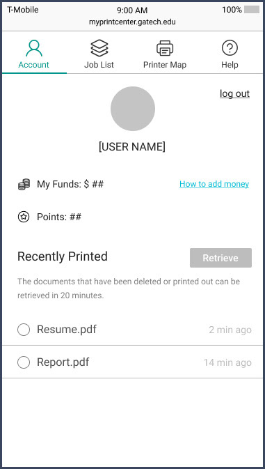
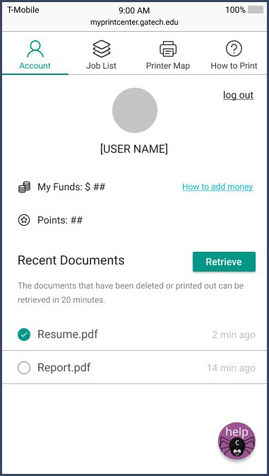
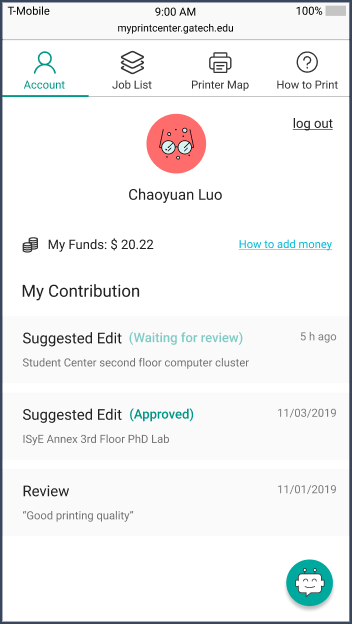
Account
Shows printing funds and points gathered from reporting problems with printers. The tab also contains an area where users can retrieve previously printed files.
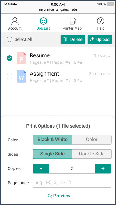
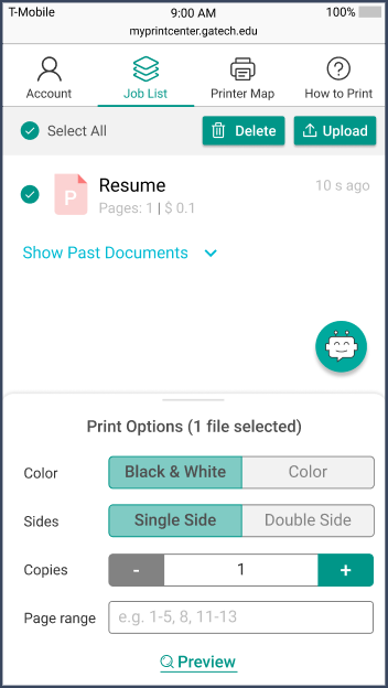
Job List
Where users upload their documents in preparation for printing. They can change print options even after uploading the documents.
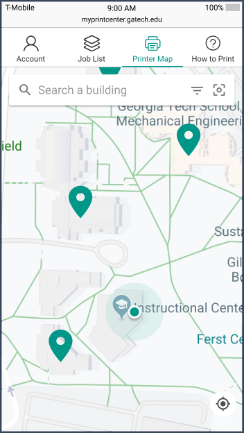
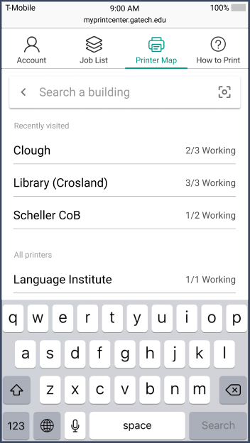
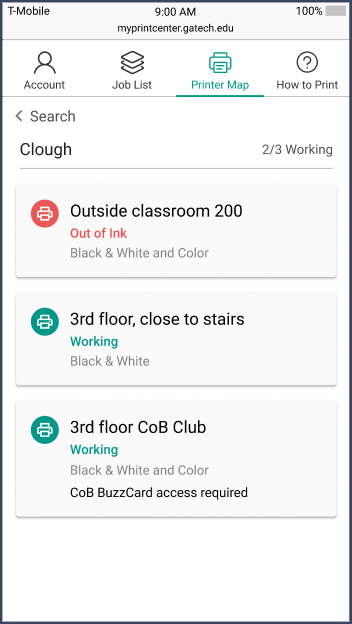
Printer Map
This tab shows the locations of printers. Users can search by buildings, then see the status of printers (working, out of paper, or broken).
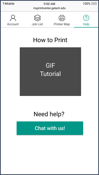
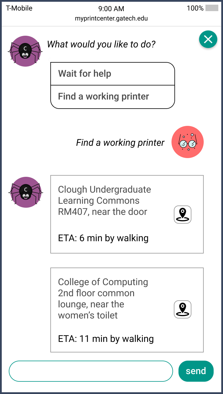
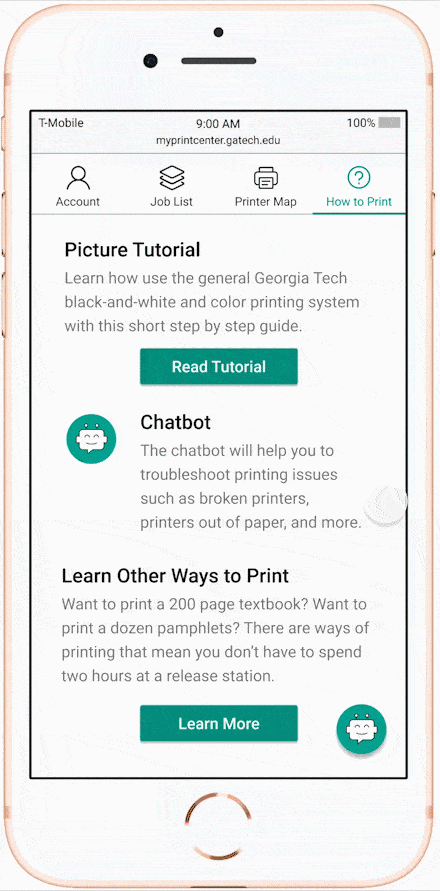
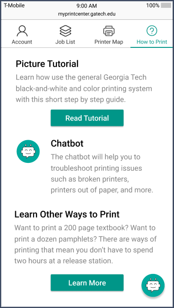
Help
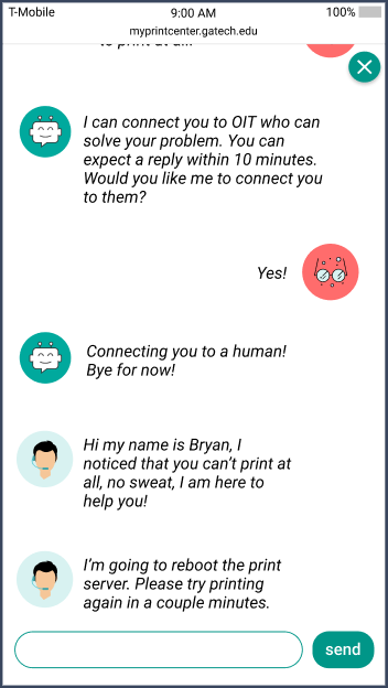
Users can go to this tab to see a GIF tutorial of how printing works. They can also start to use the chatbot if they're having trouble.
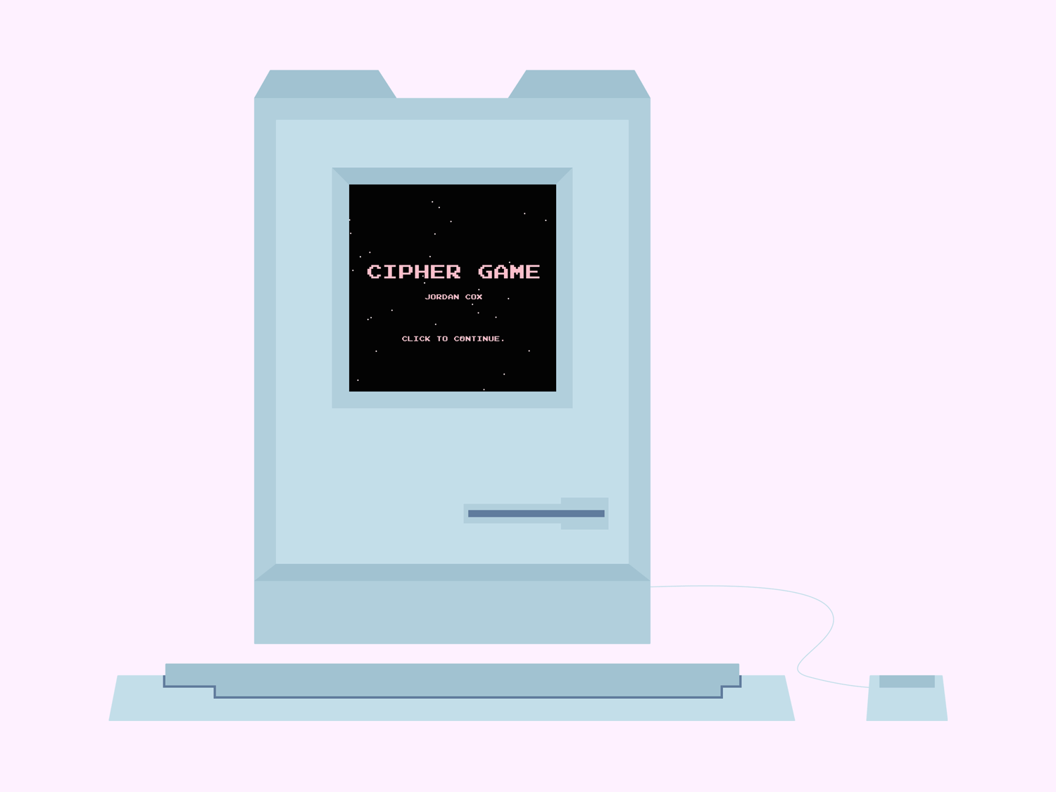
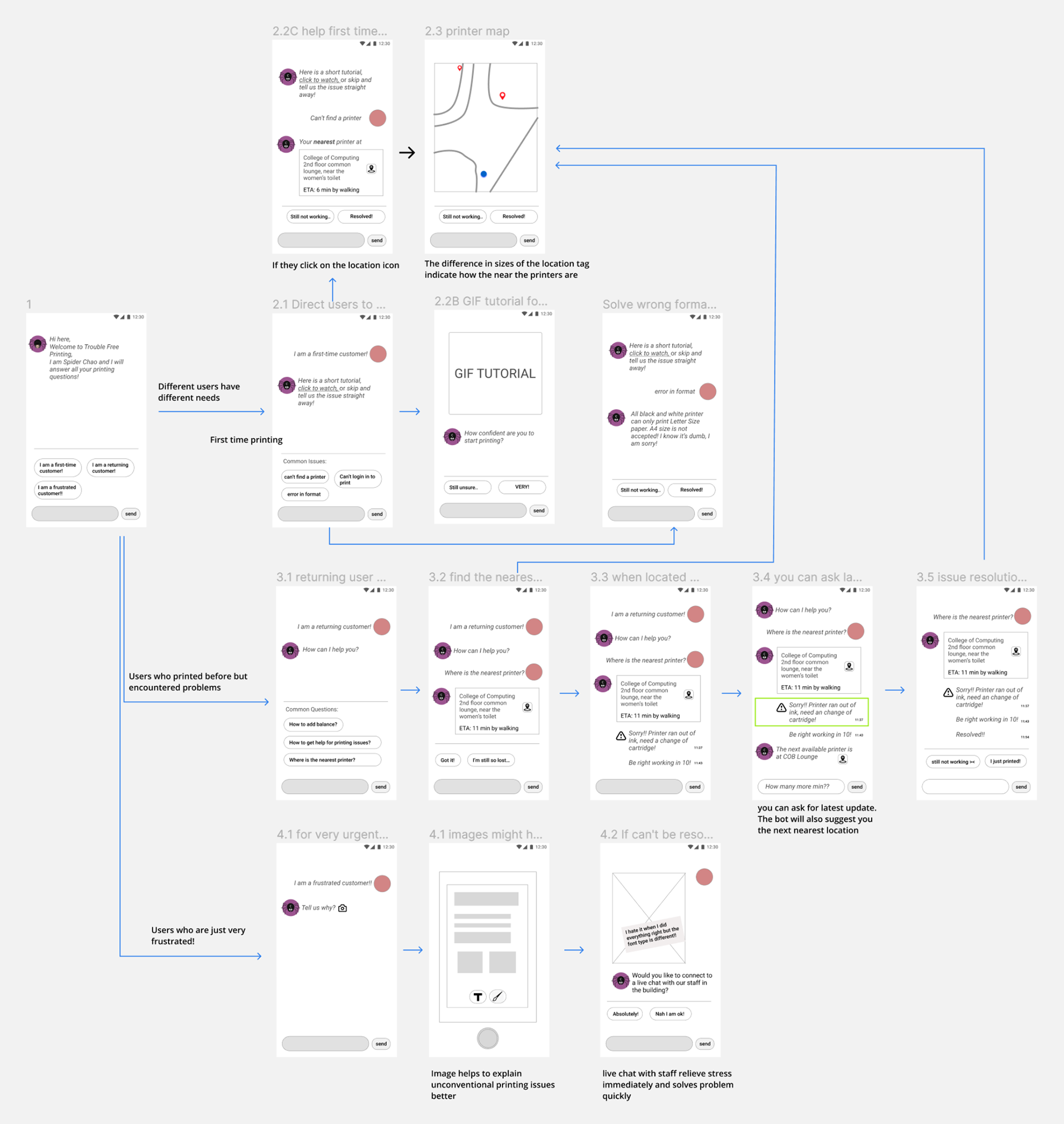
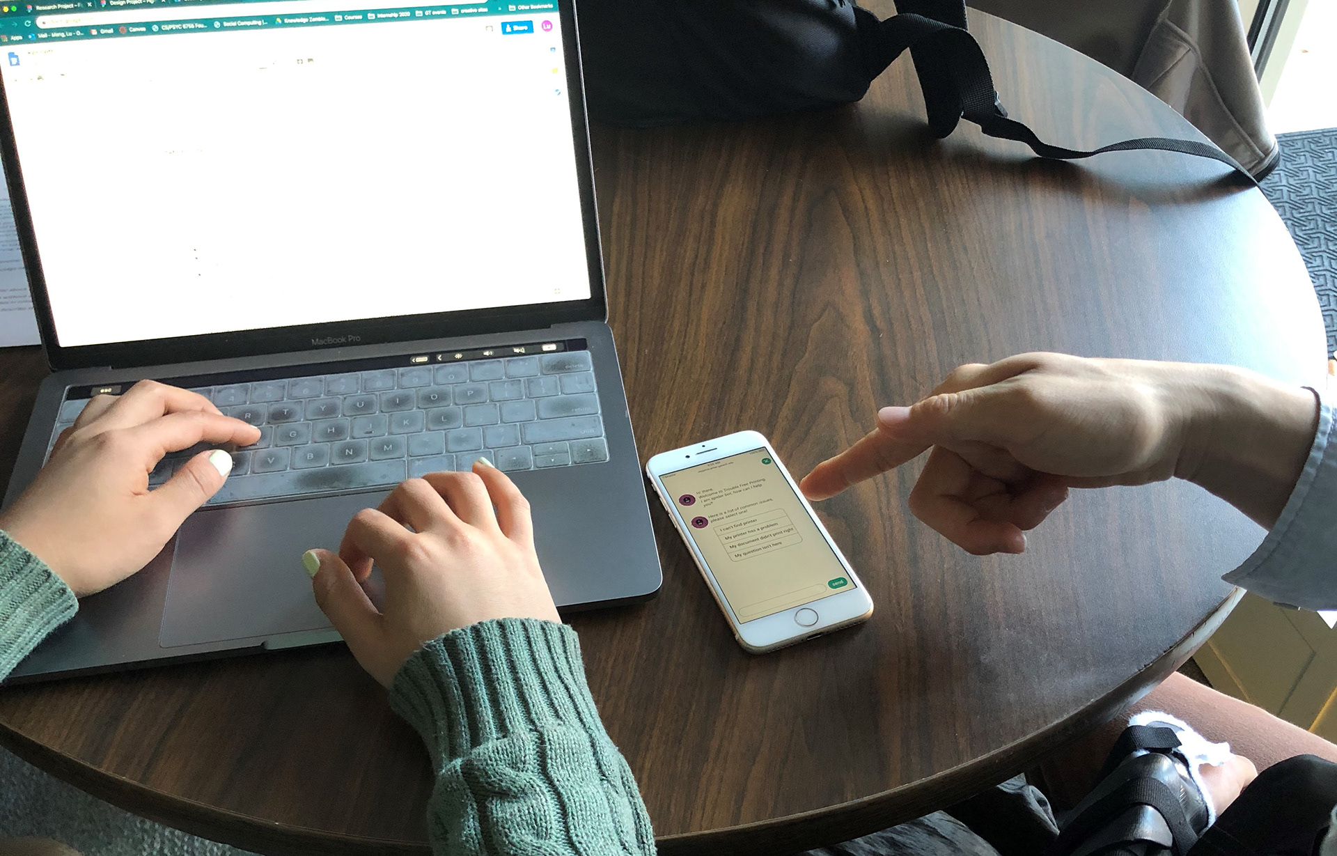
Integrating the Chatbot
We found that the chatbot wasn't salient enough when the only link to it was in the Help tab. We added a chat button to the bottom of the screen, so that help would become more contextual.
While integrating the chatbot, I worked with another team to flesh out the sequence of user interactions with the bot. We needed a screen for each of the options that the user could choose.
After pulling the chat bot out of the Help tab, we changed the tab's name to How to Print. I then worked on creating the GIF tutorial.
Why a Web App?
We decided that our solution would be a web app instead of a mobile app, because users would need to be able to easily access it. We didn't want to limit entry into the design by forcing users to download the app.
The web app allows users to access it from anywhere on any device. Because our design was intended for users to be able to access it while on the go, the web app is more flexible in this aspect.
Evaluation Plan
Goals
We created an evaluation plan to test the success of our prototype. We wanted to know how easily users could accomplish the tasks that we chose for them. These tasks focused on the key parts of our design, such as uploading a document and finding a printer.
Participants
We recruited our participants from Georgia Tech's students, because they would be the ones using our design. For expert evaluation of our design, we conducted sessions with our professors and second years in the HCI program.
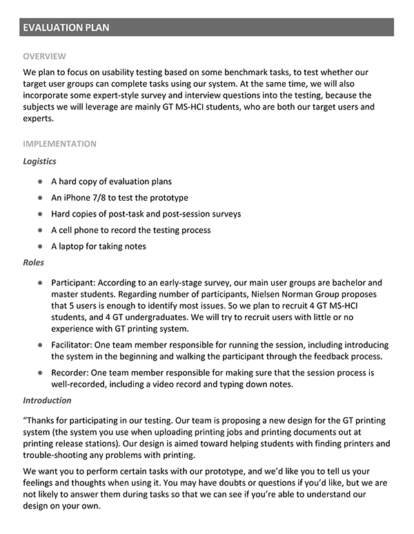
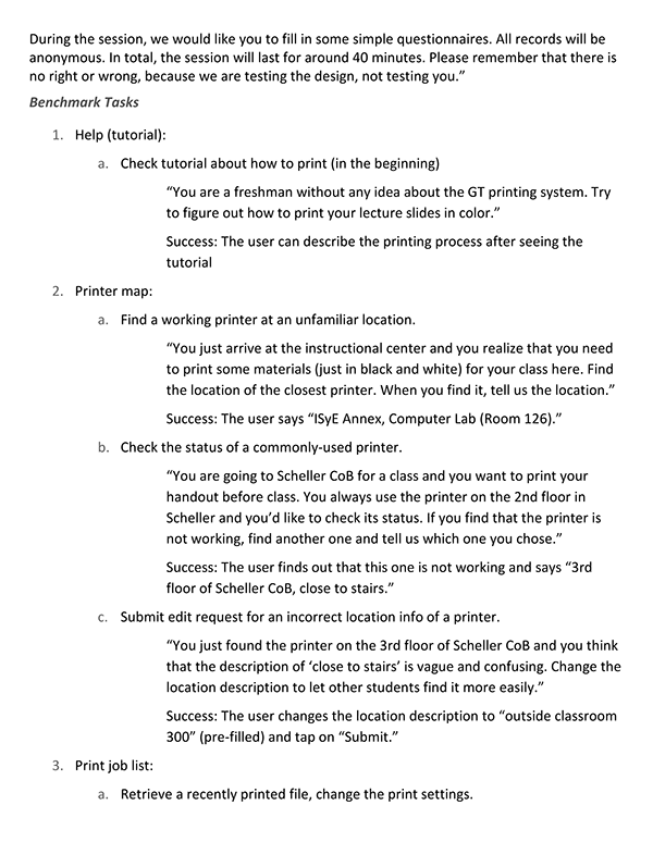
User Testing
Our user testing showed that users felt that our design was much easier to use than the current Print Center. We received an overall system usability score of 83.325.
However, that didn't mean that our users found every part of the design easy to use. Most users had difficulty finding printer locations in the Printer Map tab. Users also didn't understand or couldn't find the retrieve documents function in the Account tab.
We found the first issue to be because we weren't able to implement a search function in our prototype. The second issue was because of location. Users didn't associate retrieving documents with account information. These issues and others allowed us to see where we could improve our design.
Using Feedback for Changes
Account
We removed the point system because it was no longer part of the design, then added a list of contributions.
Job List
We moved the retrieve documents function to the Job List tab and renamed it Past Documents.
Printer Map
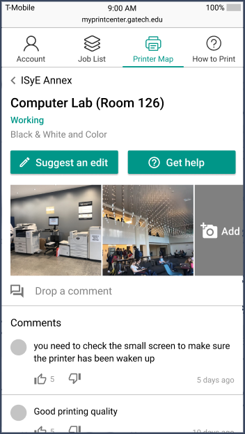
We made the info on the printer cards more salient and reorganized the printer individual pages so that the buttons at the top would have equal weight.
How to Print & Chatbot
I changed the tutorial so that it would also contain information about how to use our design to print, then added more text descriptions to each step in the process. I also changed the How to Print tab so that it had three sections: a link to the tutorial, a description of the chatbot, and a link to further information about printing.
Final Design
Takeaways & Lessons Learned
Takeaways
During this project, I saw that you don't have to create an extremely innovative solution when working with a problem. It's better to create a solution that's easy to use.
Lessons Learned
One of the most important aspects that I learned was how to collaborate with teammates so that we could communicate without problems and work together virtually. I learned how to moderate usability and feedback sessions so that they proceeded in the intended manner. Also, I learned how use prototyping tools collaboratively and efficiently, such as creating components for standardization.